Overfitting is one of those words you hear constantly in machine learning circles. Try reading the LightGBM parameters documentation, and you’ll see it (and its companion, regularization) pop up over 19 times, just on that single page.
I was taught, in a somewhat hand-wavy fashion, that overfitting happens when a model learns the training data too well. But that phrasing immediately rubbed me the wrong way. Isn’t learning well the whole point? Don’t we want our models to learn as much as they can?
Truth is, the real problem isn’t learning but generalization. A model that overfits memorizes the training data instead of learning the underlying pattern. That translates to impressive scores on data it’s already seen, but disastrous predictions on anything it hasn’t. Google’s definition sums it up well:
Overfitting means creating a model that matches (memorizes) the training set so closely that the model fails to make correct predictions on new data.
This is precise and true, but still felt abstract to a visual learner like me. And if you feel the same way, you’re in luck. This article is dedicated to helping you see what overfitting looks like, how to trigger it, and a we'll touch on how to fight back. We’ll build some toy datasets, train models of varying complexity, and even throw in an interactive plot you can play with yourself.
Can't wait? I hope so!
1. A Gentle Start: Fitting Curves with Polynomials
To build an intuition for overfitting, we’ll start with a tiny dataset of 25 points that follows the curve of $f(x) = x^3$, with a bit of added noise. We'll hold out 8 of those points for testing, and use the rest to train our models. Nothing fancy yet, just a single feature and a single target, easy to plot and understand!
Here’s the data generation code:
from sklearn.model_selection import train_test_split

rng = np.random.default_rng(SEED)

X = np.linspace(-2, 2, 25)
y = (X ** 3) + rng.normal(0, 2, size=X.shape)

X_train, X_test, y_train, y_test = train_test_split(
    X, y, test_size=0.3, random_state=SEED
)
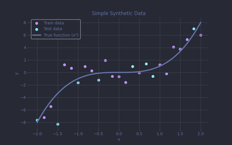
Notice the gray curve? It's our underlying function $f(x) = x^3$ upon which our noisy dataset is based. The models never get to see it. It represents the true pattern we're hoping they’ll uncover. The purple dots are the data the model actually sees.
Now that the data is ready and we’re aligned on the goal, let’s throw in some models. Specifically, we'll train 16 polynomial regressions, with degrees ranging from 1 (a straight line) all the way up to 16 (basically a spaghetti curve, and exactly enough complexity to literally hit every points in the training set). For each one, we measure the mean absolute error (MAE) on both the training and test sets. That way we can keep track of how well the model fits the training data, and how well it generalizes to unseen data.
from sklearn.preprocessing import PolynomialFeatures
from sklearn.metrics import mean_absolute_error

degrees = list(range(1, 17))
results = []

for degree in degrees:
    poly = PolynomialFeatures(degree)
    X_train_poly = poly.fit_transform(X_train)
    X_test_poly = poly.transform(X_test)

    model = LinearRegression()
    model.fit(X_train_poly, y_train)

    y_train_pred = model.predict(X_train_poly)
    y_test_pred = model.predict(X_test_poly)

    results.append({
        "degree": degree,
        "train_mae": mean_absolute_error(y_train, y_train_pred),
        "test_mae": mean_absolute_error(y_test, y_test_pred),
        "y_plot_pred": y_plot_pred
    })
Let’s explore how model complexity affects prediction performance in a visual way.
Use the slider above to change the degree of the polynomial used to fit the data. As you increase it, the model becomes more flexible: it can bend more to follow the data. The plot is split in two:
- Left side: the actual fit of the polynomial model.
- Right side: the mean absolute error (MAE) on both the training set (in purple) and the test set (in cyan), shown as a function of polynomial degree.
Start at degree 1. This is a simple straight line, $f(x) = ax + b$. It can’t capture the curve in the data, so it underfits. That translate to higher error than is ideal on on both sets on the left.
Now slide up to degree 3. As expected, this hits a sweet spot. The curve closely follows the shape of the ideal curve, and the error on the test set reaches its lowest point, although keep in mind that with noisy test data, a slightly higher-degree model might occasionally score better just by chance.
Now crank it all the way up! The high-degree model starts to memorize the training points. Eventually, as we reach an order equal to the number of training points, the curve twists and contorts itself to all of them exactly right (MAE = 0 on training). But that comes at a cost: the test error shoots up. The model has learned the noise in the data, not the signal. And that’s classic overfitting.
So go ahead, move the slider, and see how the models start loosing the plot!
2. From Curve Fitting to Income Prediction
Now that we’ve explored overfitting on an abstract mathematical level, let’s step things up a bit. We'll simulate a slightly more realistic dataset: income as a function of age, with a few extra features thrown in to mimic the noise and randomness you'd find in real-world data. Only the age feature actually matters, which keeps everything simple enough to plot.
Simulating Real-World Data (Sort Of)
Here are the rules of our little imaginary world:
- Kids under 12 earn nothing (child labor laws and all).
- On average and from 12 to 30, income rises rapidly, though but not linearly. Think summer jobs and internships, then first full-time gigs and after that career growth kicking in.
- After that, things are more stable: a slower but steady climb.
- Past 60, average income starts to slowly decline as retirement sets in.
We'll model those with a piecewise function :
$$ \text{income}(a) = \begin{cases} 0 & \text{if } a < 12 \\[2pt] \displaystyle \frac{55000}{(30 - 12)^3} \cdot (a - 12)^3 & \text{if } 12 \leq a < 30 \\[6pt] \displaystyle 55000 + 350 \cdot (a - 30) & \text{if } 30 \leq a < 60 \\[4pt] \displaystyle 65500 - \frac{15500}{30} \cdot (a - 60) & \text{if } a \geq 60 \end{cases} $$
Just sprinkle in a good amount of noise (especially for middle-aged poplulation) and that's it !
def income(age, rng=None):
    if age < 12:
        income = 0
    elif age < 30:
        a = 55000 / ((30 - 12) ** 3)
        income = a * (age - 12) ** 3
    elif age < 60:
        income = 55000 + 350 * (age - 30)
    else:
        income = 65500 - (age - 60) * (15500 / 30)

    center = 55
    half_width = 45
    k = 1 / (half_width ** 2)
    noise_factor = max(0, -k * (age - center) ** 2 + 1)

    income += rng.normal(0, noise_factor * 20000) if rng else 0
    return max(0, income)
To make things more interesting, we'll create the data by sampling our function using a somewhat realistic age distribution. In this case, that means more 40-year-olds than elderly or toddlers, as if we were drawing names at random from a national registry of a western country. The resulting dataset will have fewer information at the edges, which will give our models something to struggle with.
To raise the stakes, we also add a few distractor features: random numbers, arbitrary categories, and one age-related signal. Except for the last one, they cannot help predict income. The model doesn’t know that however, and those extra features give a lot of patterns to an eager-to-overfit model to latch onto.
def generate_data(nb_rows, linear_sampling=False):
    rng = np.random.default_rng(SEED)

    if linear_sampling:
        age_feature = np.linspace(0, 90, nb_rows)

    else:
        normal_dist_ages = rng.normal(loc=40, scale=18, size=nb_rows*2)
        age_feature = normal_dist_ages[(normal_dist_ages >= 0) & (normal_dist_ages <= 90)][:nb_rows]
        if len(age_feature) < nb_rows: print('Unlucky Seed!')

    y = np.array([income(x, rng=rng) for x in age_feature])
    dist_from_peak = np.abs(60 - age_feature)
    uniform_noise = rng.uniform(0, 100, size=nb_rows)
    normal_noise = rng.normal(50, 20, size=nb_rows)
    random_cat = rng.integers(0, 9, size=nb_rows)

    X = np.column_stack([
        age_feature,
        dist_from_peak,
        uniform_noise,
        normal_noise,
        random_cat
    ])

    return X, y

X_train, y_train = generate_data(1000)
X_test, _ = generate_data(200, linear_sampling=True)
y_test = [income(age, rng=None) for age in X_test[:, 0]]
And here is the resulting plot.
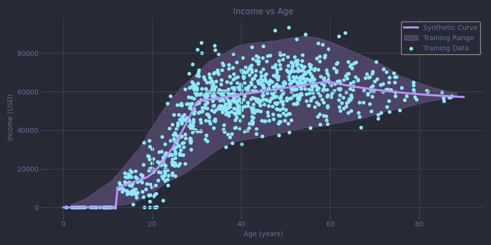
Just like in Part 1, the gray line shows the true underlying curve, which represents the trend we want our models to uncover. To ensure the models are tested across the entire age range, the test data is sampled uniformly along it (that also happens to make the plotting easier !). The purple dots are the noisy training data the model learns from, and the shaded band captures the variability in income at each age, based on the training data's spread (specifically, it's a smoothed interquartile range showing the spread of middle 50 percent of values).
It’s still a pretty simple dataset, but it’s just complex enough to make things interesting. And unlike the polynomial example, this time we’ll use a more powerful algorithm: gradient-boosting trees, in which we build an ensemble of decision trees, each one correcting the errors of the previous.
One Dataset, Three Very Different Fits
The chosen implementation for this demonstration is LightGBM. In order to compare the effect of complexity, we’ll train three models, each representing a different archetype:
- An "overfitter", with far too much capacity and no guardrails.
- An "underfitter", too constrained to capture the patterns in the data.
- A well-regularized model, tuned via cross-validation and grid search.
All models use the same learning rate (0.05) to keep the comparison fair. In practice, though, learning rate and model complexity often go hand in hand: smaller learning rates typically pair better with deeper models. For evaluation, we still rely on MAE, but this time the test data is noiseless. That makes it easier to assess how well the model captures the underlying signal, but keep in mind that this setup favors models with smoother predictions. Just like in our earlier example, with noisy test data, a slightly overfit model will often score a lower MAE just by chance.
# Overfitting Model
overfit_params = {
    'num_leaves': 128,
    'num_iterations': 1000,
}
overfit_model = lgb.train(common_params | overfit_params, train_dataset)
y_preds_overfit = overfit_model.predict(X_test)
Here, we allow the model to grow very large trees by setting num_leaves = 128. Combined with min_data_in_leaf = 1 (which is set by default for all of our models), this gives the model permission to fill those trees with tiny, highly specific leaves, some of which may only apply to individual training points. We also give it plenty of boosting rounds, leaving it "time" to memorize the training data. Unsurprisingly, this leads to heavy overfitting.
underfit_params = {
    'num_leaves': 2,
    'num_iterations': 50,
}
underfit_model = lgb.train(common_params | underfit_params, train_dataset)
y_preds_underfit = underfit_model.predict(X_test)
This one is the exact opposite. With num_leaves=2 and just 50 boosting rounds, the model can create at most 100 simple rules like if age < 10 : return 0. That’s far too limited to capture subtleties like the early adulthood income increase or the gradual decline near retirement, especially since some of those rules might be wasted on our distractor features.
param_grid = {
    'num_leaves': [2, 3, 4, 6, 8],
    'min_data_in_leaf': [1, 2, 3, 4, 5, 8, 10, 20],
    'lambda_l2': [0, 5, 10, 15, 20, 25, 30, 40, 50],
    'colsample_bynode': [1, 0.8, 0.6, 0.4, 0.2],
}

keys = list(param_grid)
values = [param_grid[k] for k in keys]
param_combinations = [dict(zip(keys, v)) for v in product(*values)]

best_score = float('inf')
best_params = None

for combination in tqdm(param_combinations):
    model = lgb.train(
        common_params | combination | {'num_iterations': 10000, 'early_stopping_rounds': 20},
        train_dataset,
        valid_sets=lgb.Dataset(X_test, label=y_test, categorical_feature=[4])
    )
    mae = mean_absolute_error(y_test, model.predict(X_test))

    if mae < best_score:
        best_score = mae
        best_params = combination | {'num_iterations' : model.best_iteration}

regularized_model = lgb.train(best_params, train_dataset)

print('Trained Regularized Model')
for name, param in best_params.items():
    print(f'{name} : {param}')

y_preds_regularized = regularized_model.predict(X_test)
Let’s try to strike a balance for our final model. We run a grid search over a few hyperparameters to find a configuration that performs well. Since the problem is still very simple, we expect small trees to be sufficient, so we keep num_leaves low.
LightGBM automatically determines the ideal number of boosting rounds when passing it our test data as a valid_set. If adding more trees doesn’t improve the error for a while, it stops early. This avoids unnecessary complexity is our first and most important barrier against overfitting. If needed, the model is also allowed to be regularized further in 3 different ways :
-
min_data_in_leaf, which we already encountered, -
lambda_l2, which penalizes large leaf weights and encourages smoother predictions, -
colsample_bynode, which randomly limits the number of features considered when splitting each node. Since we have 5 features in total, 0.6 would correspond to 3 features, for example.
We evaluate all parameter combinations and keep track of the one that minimizes MAE. Then we retrain a final model using those optimal settings.
The grid contains 1,800 combinations, and even though that's quite a few, it's still manageable for this simple dataset. For larger-scale problems, a full grid search like this would be very expensive and you'd probably be better off using a smarter search algorithms like Optuna or gp-optimize from scikit-optimize. Here I am able to perform the full grid search in less than 40s on my CPU. And the best hyperparamters found are as follows:
num_leaves : 2
min_data_in_leaf : 2
lambda_l2 : 15
colsample_bynode : 0.8
num_iterations : 188
The best model for this simple problem turned out to be even smaller than I expected: just 2 leaves per tree, and only 188 boosting rounds. This most likely leads to the most impactful regularization. Other settings like min_data_in_leaf were used, but probably had less influence in this case.
It’s a good reminder that for small problems, simplicity often wins. Controlling model size and iteration count is still one of the most effective (and maybe overlooked?) ways to prevent overfitting.
Overfit, Underfit, Just-Right: The Visuals
Let’s now see how our three models perform. Each subplot shows the synthetic ground truth (grey line) - for your eyes only, not the models’! The data distribution is still there too, along with each model’s predictions in color.
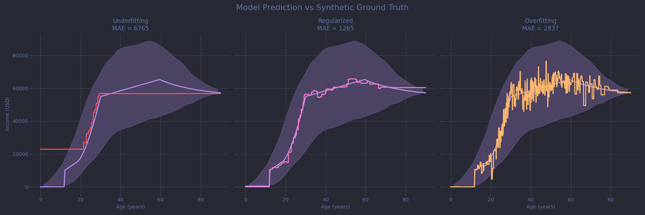
On the left, the model does a decent job at predicting the age-income relationship but is too coarse to describe the subtleties. It simply ran out of decision leaves. On the right, we see a different kind of disaster. The model "sticks" to the noisy data, especially in regions with plenty of examples to learn from. But by reacting to every local bump and wiggle, it completely loses the big picture.
In the middle, the regularized model does a much better job of following the true curve. Still, it struggles with a few large outliers around age 60 and tends to overestimate income for younger children (a flat region with little training data). It might be tempting to let the model fit more closely there, but doing so would likely cause overfitting in better-covered areas like around 60 where the model is already having difficulties. It’s a classic trade-off: there’s rarely a perfect set of hyperparameters that performs well across the board. Most of the time, you're simply picking the least-bad compromise. And keep in mind that this is still a toy problem, with just one relevant feature and a thousand data points. As your datasets grow in size and complexity, the balancing act only gets more difficult.
I should mention that there are multiple ways to address this kind of imbalance. In this case, I’d probably try giving more weight to rare cases (like children and elderly samples) during training, and then regularize the model even further, but that comes with its own caveats.
Let's finish by taking a look at the features importances plots.
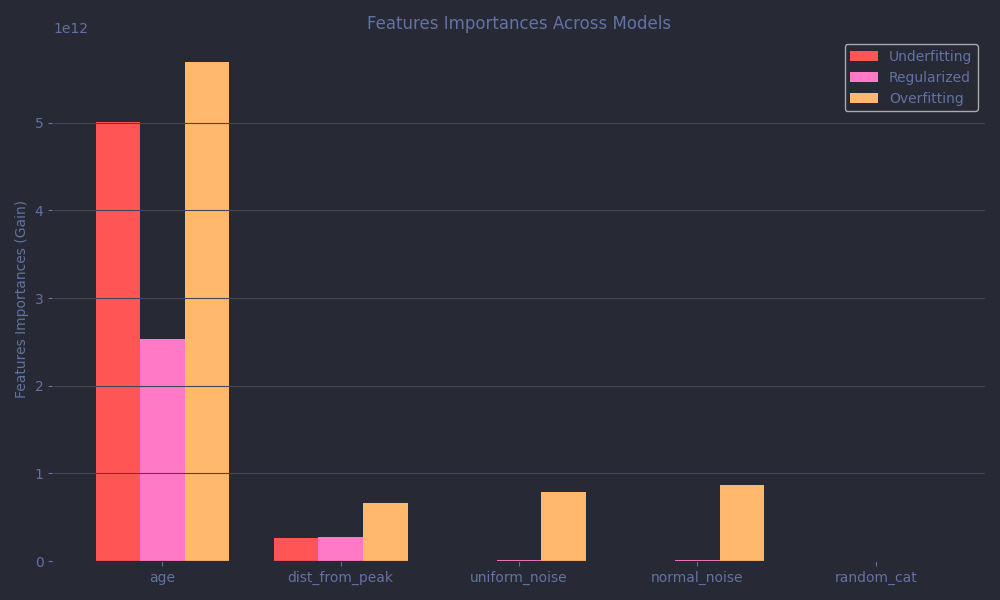
All models rely heavily on the age feature, as they should. The very correlated but quite redundant dist_from_peak is ignored across the board, as is the random categorical feature, although in the case of the underfit model, this is likely a result of limited capacity rather than discernment. The overfitting model, on the other hand, starts assigning importance to two of the completely meaningless features: uniform_noise and normal_noise. That’s a classic overfitting behavior, finding non-existent "patterns" in pure noise.
Conclusion
I hope this was a helpful introduction to overfitting, a small chapter in the much larger topic of machine learning. And to be clear, we’ve only scratched the surface here. In real-world projects, overfitting is a complex issue, and the tools to address it vary widely depending on dataset architecture and model choice. That said, some core ideas and strategies tend to carry over across models and domains, and no matter what kind of problem you're tackling, developing a good intuition for what overfitting looks like is always valuable.
In the end, the better you understand your data and your model’s behavior as you tweak both your feature engineering and hyperparameters, the more likely you are to find that sweet spot between memorization and over-simplification.
If you’d like to explore the full code, including the more detailed version of what was shown here and all the non-interactive visualizations, you can find the complete notebook here.
Good luck out there!
Interactive Plot: Tweak and Overfit at Will!
Originally, this article was going to stop there. But since I was already deep into Plotly and JavaScript for the polynomial vizualisation, I decided to build an other one for us to explore the age-income problem too. Below, you can adjust the hyperparameters and see in real time how they affect the model’s predictions.
A quick word of caution: the dataset is a toy demonstration with just one truely relevant feature and a few hundred data points. In real-world scenarios, with noisy, high-dimensional data, hyperparameters will behave differently. The settings that work here almost certainly won’t transfer to your next Kaggle competition or production pipeline.
Still, it’s a great way to build intuition for the trade-offs involved. So go ahead, try it! Watch how the model hugs or ignores the data. See how the wiggles form when you let it overfit and how they vanish when you regularize! Try fitting the children or the around 60 range better and see what happens! By default, the sliders are set to a well-balanced model, but I’ll let you in on a secret: there are exactly 525 sets of hyperparameters with a lower MAE hidden in there. Think you can find a few?