I recently took part in a data analyst bootcamp, which wrapped up with a two-week group project. We were meant to put all our new skills into action, from acquiring the raw data to building dashboards, with a bit of machine learning and storytelling along the way.
One of the deliverables is a 77-page report (available here, though only in French), and a 30-minute presentation to defend it in front of a jury. That presentation is what I’m going to walk through here. The slides have been translated and adapted, so some of the formatting may have shifted slightly, but if you're curious, the original French version is available too.
This isn’t a transcript though. I’ve added commentary alongside each slide explaining what I was aiming for, what worked (or didn’t), and what I learned in the process. You’ll find reflections on pacing, design, preparation, and even a bit about how to frame criticism without shooting yourself in the foot.
Curious? Let’s dive in!
Slide 1 - Title Slide
Every presentation needs a title slide, and this simple one does the job. What matters more here is how this slide sets the color scheme for the entire slide deck, based on the logo we were given in the project brief. It has a greenish background and a blue-to-white gradient in the lettering, which I stayed consistent with throughout the presentation. It’s a small detail, but it gives the whole deck a sense of coherence and polish, which I think matters a lot when trying to convince someone, whether it’s a jury, a client, or your boss.
This is also a good moment to talk about preparation. For each slide, I wrote down a few keywords or short sentence fragments. Building on those in the moment feels much more natural than reading full paragraphs, and a lot more engaging than the uhhh and aaand... I’d be left with otherwise. Full improvisation can work if you’re extremely comfortable with the material and good at managing stress, but I know I’m not quite that person (yet?).
You can find all my talking points for every slide embedded in the downloadable presentation. I won't include them all in this recap, but just to give you an idea of what that looks like, here’s what I had down for this one:
- Hugues Bousquet
- "Data Analyst & AI" La Capsule bootcamp - Batch 3
- Presentation of end-of-course project
- Condensed version of full report
- Group of four participants (you have talked to earlier)
Nothing groundbreaking, but having this kind of notes in front really helps me keep the flow smooth, and makes it easier to recover quickly if/when I lose my train of thought.
Slide 2 - Problem Recap and Framing
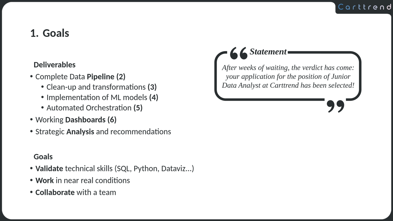
I knew that by the time I got to present, the jury would have already heard from a few groups, and since we all had the same exercice, I didn’t want to spend too long rehashing the statement. Still, I needed to make sure we were on the same page.
The scenario (working as junior data analysts for a company called Carttrend) wasn’t especially compelling on its own, and the implementation was solid, but nothing to write home about. What really mattered was showing what we'd learned, and how we applied those skills in a somewhat more realistic setting. So instead of focusing too much on the fictional problem, I chose to partly frame this slide (and really the whole presentation) around the purpose of the exercise itself. To reflect that, I split the project’s goals into two sections. One lists the deliverables: clean datasets, ML models, dashboards... The other focuses on the pedagogical goals: correct use of the right tools, effective collaboration...
But this slide also has a second, more subtle purpose. Noticed the numbers in parentheses next to each deliverable? They actually form the structure of the presentation. I really don’t like dedicated outline slides; they’re usually a dead moment with nothing to say except paraphrasing what is already shown. ("Next, we'll talk about...". That rings a bell?). This was my attempt to weave the outline into the content itself. In hindsight, I believe it was a bit too subtle, and I don’t think anyone caught it. If you try something similar, it might be worth calling attention to it more directly.
Finally, to keep the slide from feeling too dry and break up the monotony of the bullet point lists, I decided to design a cute quote box with a line from the project brief. It's also a subtle reminder to the jury that, yes, we actually read the prompt!
Slide 3 - Tech Stack
This is a quick one; just a simple list of the tools we used throughout the project.
Since the jury were supposed to be industry professionals, I didn’t need to explain what each tool does. So I kept it tight: 30 seconds tops for the whole slide. Even the notes I had for myself were condensed, like: “Data Warehouse = BigQuery + SQL”, expanded on the fly to something like: "Then for our Data Warehouse, we chose Google's BigQuery, which requires a good knowledge of SQL."
To keep things colorful and a bit more engaging, I used each tool’s logo and added some simple, non-distracting reveal animations. They are triggered sequentially and on click - except when two tools are related to each other (like the BigQuery and SQL exemple from earlier) - allowing me to pause everything in case of questions. And that’s a good lesson: animations should not be a source of panic because you missed the timing or got interrupted. Design them in a way that lets you stay in control of the pacing, and make sure you have a clear understanding of what will happen with each click.
Slide 4 - Pipeline Architecture
Since this slide describes a process, a flowchart was the obvious choice. It takes up the full screen, with a large, clearly labeled legend to explain the different types of arrows.
The animations follow the logic of the pipeline: one click to both fade out the previous step and animate the next one. That way, I could stay focused on explaining each part as it came up, and just click once at the end of each sentence. At the end of the sequence, all the arrows are revealed (not shown in the video). By that point, the audience has seen each part of the process individually, and they now get the full view, ready for questions and discussion.
Design-wise, I flipped to a white-on-dark theme for this one. The previous two slides were both dark-on-light, so I wanted to break the visual rhythm a bit while still staying fully consistent with the color palette. You might also notice the rounded, wide-edge boxes. They’re a callback to the edge design used in the previous slides, which is itself inspired by the dashboards we built during the project. They’re a key part of the presentation’s design language, and you’ll see them reappear throughout the rest of the deck.
Slide 5 - DBT Staging Code
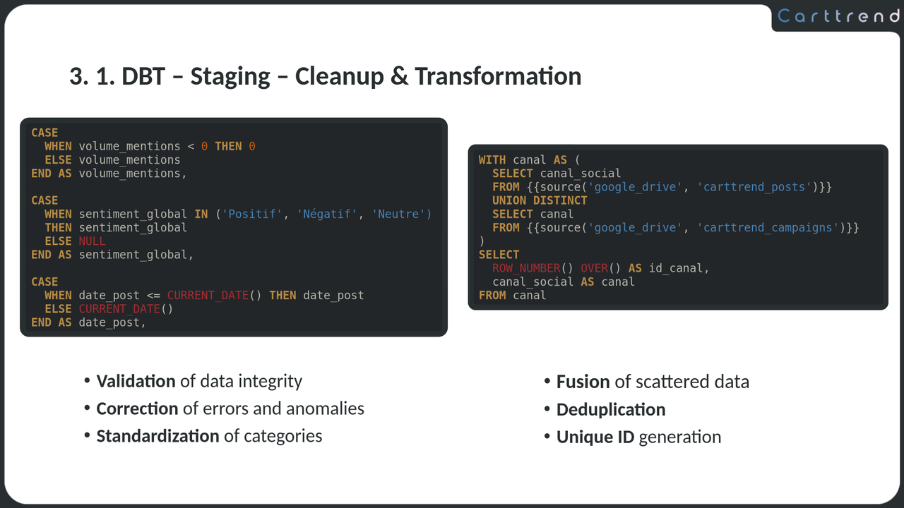
After presenting the big-picture pipeline, it makes sense to start diving into the details. The extraction step doesn’t warrant its own slide: we used a fully managed tool that took care of everything automatically. If someone had asked for more detail, the previous slide would have been more than enough to explain it. So I'm moving straight into transformation, starting with our DBT staging models.
Including code in the presentation is essential in this case. Part of the evaluation is based on technical skills, and I wanted to make sure those came across. But code on slides can be tricky: too much, and it quickly becomes overwhelming. That’s why the code you’ll see in this deck isn’t copied directly from the project. Instead, I created simplified snippets that illustrate a specific point. In this case, it's showing how we cleaned and structured the data during the staging phase.
One detail I really care about: the code isn’t a screenshot from an IDE. It’s actual copy-pasted text, with manually applied syntax highlighting. It takes a bit more time, but the payoff is twofold. First, because it’s vector text, it scales cleanly to any screen size without blurring. And second, it lets you choose a color scheme that matches the rest of the presentation. And if it feels like too much effort for too little reward, that might be a sign you're including too much code in the first place...
One more general rule I try to stick to: try to make the code speak for itself, and leave most of the extra explanation needed for the spoken part. Don’t overload the slide with lengthy text boxes or (worse!) detailed inline comments. Your audience already has to read code, don’t make them read your commentary too.
Slide 6 - DBT Mart Code
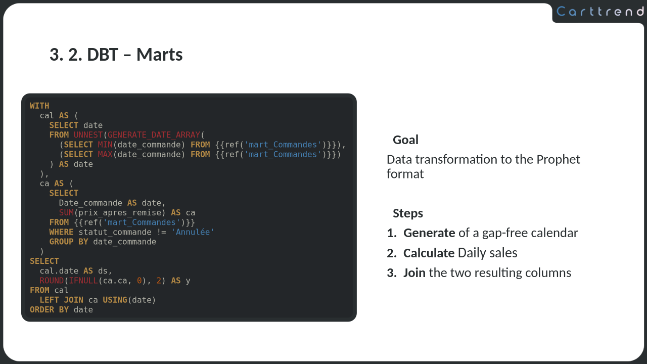
This slide follows the same format as the previous one, so many of the same principles still apply. The code snippet isn’t pulled directly from the project; in this case, it’s actually quite far from the original. But that doesn't matter! The goal here is to clearly illustrate the idea of a mart, and if it means crafting a simplified example from whole cloth, so be it!
One thing worth pointing out: on these code slides, my spoken commentary is intentionally not tied to the code line by line, walking through every detail. Instead, the code is written to be clear enough to stand mostly on its own, maybe with the help of the few bullet points included on the slide. That frees me up to focus on the bigger picture: what the code is for, how it fits into the overall pipeline, and why it matters. I only give a high-level overview of how it works, but I also know it well enough to go deep if questioned. And for the record: no one asked.
To give you a sense of what I covered here, here are the quick notes I had in front of me:
- Marts: data prep for dashboards and ML
- This one: sales forecast prep (time series)
- Prophet requires
ds(no gaps) andy - Each column created in a CTE, then joined
-
LEFT JOINto preserve full date range -
ISNULL()to get 0 for days with 0 sales
Slide 7 - Integration of external sources & ML
This slide isn’t here to add new content, as all the technical details around ML integration in the pipeline were already covered back on Slide 4. Instead, its purpose is twofold: pacing and structure. After two code-heavy slides, and with three more coming up, we are giving the audience a breather, while also subtly signaling that we’re moving forward in the pipeline, by reminding the jury how the ML integration works (in case the SQL lost them a bit).
With that in mind, I kept the content minimal and allowed myself to go a bit overboard with animations. The previous two slides are static, and the next three will be too, so this is the perfect place to add energy back into the flow.
One small design detail I’m proud of: I used the colors from each tool’s logo on the explanatory text attached to it. I lucked out and all the logos use similar tones of white, grey, and blue, so I took full advantage of it. Attention to small details goes a long way.
Slide 8 - Machine Learning Code
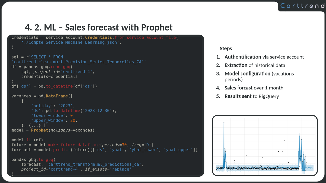
This is one of the three ML models we trained for the project, and I chose to highlight it for a couple of reasons. First, Prophet’s API is fantastic! It lets you do a lot with just a few lines of code, making it ideal for a slide: short but still meaningful. Second, the results plot allows me to plant the seed of a key message I’ll return to later: the historical sales data, with its two random peaks and the unnaturally flat line elsewhere, hints at a randomly (and pretty unrealistically!) generated dataset.
Like the earlier code snippets, this one is heavily condensed. For instance, only one holiday is defined here, even though we used two in the actual project. Honestly, it’s still a bit long for a slide, but I couldn't find a way to simplify further while staying close enough to actual code.
One more thing: I deliberately placed the code and a visual representation of its output on the same slide when I could. I really don't want to have to jump back and forth during Q&A. And speaking of layout, notice the structure: code on the left, a quick summary top right, and the result bottom right. Put a pin in that, it’ll come back later.
Slide 9 - External API
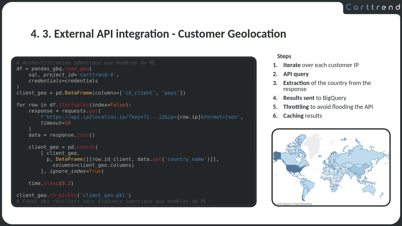
Calling an external API from inside the pipeline wasn’t part of the assignment, but we thought it would be a nice touch. The only clue we had about customer locations was through IP addresses, so we used those to fetch geolocation data and plot it on a map. It was a small thing but I think it shows initiative, and I feel it was well worth including in the presentation.
The slide shows most of the key code, except the caching logic which is just too long to fit. So I represented it with a single line: client_geo.to_pickle('client_geo.pkl'). On its own, it doesn’t do much, but it gives me a chance to explain, out loud, how we used caching to avoid hammering the API. I was prepared to go into the details of the implementation with the full code ready to pull up, and also had a few talking points available about the risks of using pickle in production and safer alternatives to it, but no one asked.
And then there’s the map. It’s completely filled in, almost uniformly across the globe, a subtle reminder (once again, mentioned in passing) that the dataset we were working with was randomly generated, and not particularly convincing.
Finally, notice the layout: code on the left, summary at the top right, result at the bottom right. Just like the previous slide. Not evicted from your cache yet?
Slide 10 - Orchestration Code
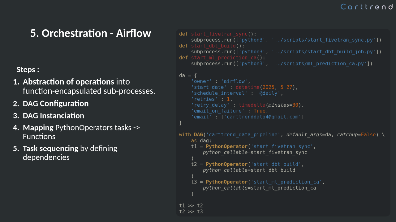
Last code slide. Finally! Thankfully it is quite simple and repetitive. You only need to understand one example to follow all three shown on the slide... and even the three others not included. It’s all the same structure, just copy–paste–tweak.
What’s more interesting here is actually the slide design. This marks the next step in the pipeline (well... technically, a step outside of it!) and I wanted to signal that without adding yet another transition slide. I was already pushing the 30-minute mark, and couldn’t afford to slow things down.
So instead, I let the design communicate the change. The last few slides have been black text on a white background? Let's flip that. Code was always on the left and explanations on the right? Now, it's the opposite. Supported by a quick verbal mention, that's just enough of a break in the rhythm for the audience to feel the transition.
Slides 11 & 12 – Dashboard Showcase
These next two slides are all about showcasing the dashboards we built during the project. We produced five in total, but for the presentation, I selected two that best represent my own contributions. The goal here isn’t to dissect every element, but to convey their visual appeal, interactivity, and overall user-friendliness.
In an ideal world, this would’ve been a live demo, which is a much better way to demonstrate interactivity. But as anyone who’s ever attempted one knows, live demos are brittle: they break, they lag, they suddenly ask you to log in again... And besides, we were working with a temporary Tableau license, which had already expired by the time of the presentation.
So instead, I went with a pre-recorded video. And just in case that failed, I had static screenshots of the dashboards embedded in the slides as a fall back. Redundancy is key.
While the video played, I didn’t talk much, as I believe the dashboards largely speak for themselves. That said, I did briefly point out a few limitations, like the lack of interaction between the machine learning results and the dynamic filters.
Slide 13 - Difficulties
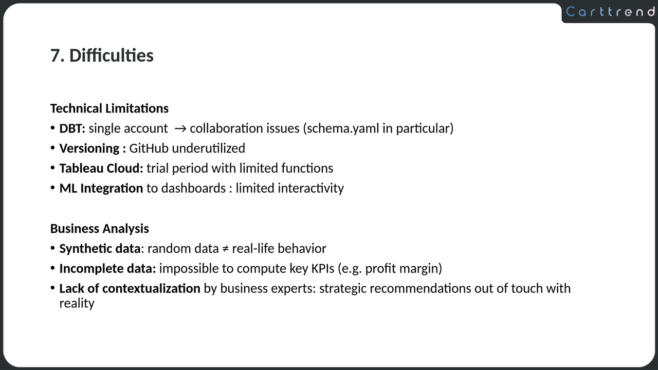
This was the make-or-break moment of the presentation.
Producing actionable insights is a big part of a data analyst’s job, maybe not quite as central as it is for a business analyst, but still. And the jury was expecting just that. But as I’d subtly hinted earlier in the presentation... in this case, there was simply nothing to analyze.
The dataset was randomly generated, and thrown together without much care. Uniform distributions everywhere. No signal. No patterns. Just noise. And yet, the expectation was still there: produce recommendations. Even if the only thing you could say was a vague platitude with no real link to the data - “Let’s do more deals around Christmas!” or “We should upsell electronics!”. That kind of thing.
Now, pointing that out is a bit of a gamble, because it implies that the dataset was poorly designed, probably by people who hadn’t given it much thought, and that many of the recommendations offered by past and future candidates were likely (LLM-generated?) nonsense filler. And I would be telling this to a jury that was supposed to be independant... but almost certainly knew the people behind the exercise.
So I tried to be careful. I prepped the ground a few slides earlier. I wrapped this central message inside a broader discussion of small technical hurdles and a few minor but real mistakes we’d made. I gave concrete examples of what was missing in the data and how no meaningful patterns emerged, a point backed up by the visualization I’d shown earlier. I prepared a personal anecdote from a past job, to humanize and illustrate the criticism. And just in case... I had a few vague-but-polished “recommendations” on standby.
Why take the risk? Mainly because it felt like the honest thing to do. And, if I’m being candid, because I figured I’d be more convincing explaining why an analysis wasn’t possible than trying to sell insights I didn’t believe in. I also secretly hoped the jury might appreciate someone being willing to say the obvious at loud. And, well... I’m a bit stubborn.
So, did it work? Sort of. One juror, clearly more focused on the analysis side, still pressed for recommendations. I was tempted to challenge him a bit, but I let it go. I gave him a few of the generic lines I’d prepared, and he moved on. Maybe he was convinced, maybe he just needed to tick a box, it's hard to tell. But he did say he appreciated the personal anecdote.
In the end, I can’t say I recommend this kind of approach. It’s certainly safer to go with the flow. I do however think that it is invaluable, in some situations, to have someone willing to swim against the current. Especially when most people aren’t really swimming at all, but just letting themselves drift along, desperately trying not to make waves. So... your call. But if you decide to try to pull a stunt like this, make sure you’re absolutely, indisputably and undeniably right. And prepare for the consequences.
Slide 14 - Conclusion
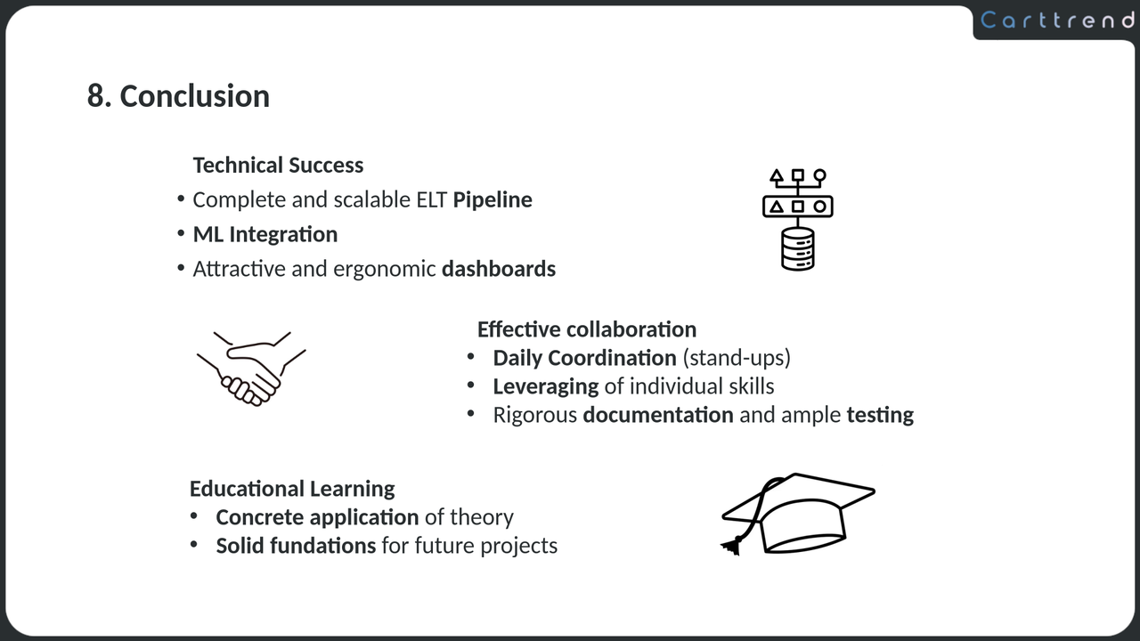
There was no way I could end on the previous slide. I needed to wrap up with something positive that would tie things together and leave the jury with a better feeling than "this whole thing was flawed."
So I went back to the goals we’d set at the beginning, both the technical objectives and the educational ones. These were listed way back on Slide 2, and now, point by point, I walked through how we’d delivered on each of them. It gives the presentation a natural ending, and more importantly, shows that despite all the limitations (which, you’ll notice, are carefully avoided here), we had accomplished what was expected of us.
I didn’t have a particularly inspired final angle, so I went with something a bit generic but safe: a nod to teamwork. It was only barely mentioned in the presentation and the written report didn’t dwell on it either, so this is a good opportunity to acknowledge the group effort and give credit where it is due.
Slide 15 - Outro
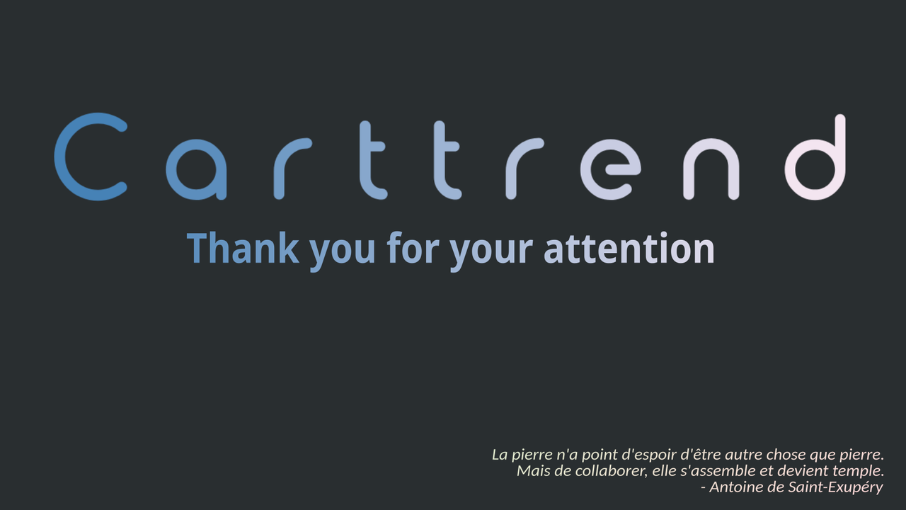
Slide 15 is a simple “thank you for your attention” screen, as you'd expect at the end. But I wanted it to echo the final point about teamwork, so I included a quote I found and liked from Antoine de Saint-Exupéry, which translated, goes something like:
A stone has no hope of being anything but a stone. But from collaborating, it assembles and becomes a temple.
It ties in nicely with the final message, and adds a small poetic touch to close things off. But it was a mistake! The first question from the jury was not about our teamwork, as I expected, but rather about the quote itself and my thoughts on Saint-Exupéry. A pretty obvious line of questioning, in hindsight. But I was completely unprepared for literary analysis, and, well... let’s just say I didn’t exactly shine in that moment.
Questions and Answers and Conclusion
The Q&A was supposed to last at least 30 minutes, and I know for a fact that it did much more than that for some candidates. But in my case, it was just a handful of questions, most of them about the analysis section I mentioned earlier, and a brief glance back at the dashboard. No technical questions at all, and not even ten minutes long. Honestly, I was even a bit disappointed!
Still, I was actually thanked for an appealing and well-paced presentation, which I genuinely appreciated! And speaking of pacing, I hit the 30-minute mark almost exactly.
I'd like to close with a few general insights and advice that really help and motivate me for this kind of work, hoping it might be useful to you:
- A good presentation shifts a huge part of the burden of being engaging from your present self to your past self. If it’s well-prepared, you won’t need to perform as well on the spot as you would otherwise for it to be a success.
- It also puts the spotlight on your work, not on you. When the slides are good, you don’t have to be the show, and that is a blessing if you’re on the shy side.
- Preparation is everything. I rehearsed this whole talk every morning and evening during the week leading up to the presentation. Talking points and even slides were tweaked daily, questions were anticipated, and clearly that effort pays off.
- And while we're on preparation: test your setup. If you work in anything remotely technical, people assume you command computers with your mind. Your presentation is not the time to dispel that myth by fumbling with cables and projectors for ten minutes!
- Finally, mind the small stuff. Things like pacing and design should not be dismissed, they shape the impression you leave, even if it is not always consciously noticed.
If you made it this far, thanks! I hope you got something out of it. And best of luck with your next big presentation!