
Midnight, April 14, 1912. You're asleep in your cabin aboard the unsinkable RMS Titanic. You're one of 1,316 passengers onboard, unaware that in a matter of hours, an iceberg will seal the fate of over two-thirds of those around you. Could a machine learning model predict your survival, using nothing more than basic details like age, gender, and ticket class? That’s the premise of one of Kaggle’s most famous entry-level competitions: the Titanic - Machine Learning from Disaster challenge.
Why spend time analyzing a century-old shipwreck? Because survival aboard the Titanic wasn’t random. Women and children were prioritized. First-class passengers had faster access to lifeboats, while Third-class passengers, especially immigrants, often never reached the upper decks. Patterns like these are what drive predictive models, and this dataset is a great opportunity to learn how to extract them and use them to make predictions.
This article follows my journey from raw data to a model predicting survival with over 80% accuracy, and reflects on what statistics can (and can’t) tell us about human fate.
A few disclaimers before we begin:
- This isn’t the solution - just a solution. There are many paths to the top.
- While I developed this approach independently, I don’t claim it's original. The Titanic dataset has been studied endlessly.
- To preserve the spirit of the competition, I refrained from using any external passenger information. No lookup of individual passenger outcomes.
- If you're brand new to machine learning, I recommend starting with Kaggle’s Titanic Tutorial. This guide more geared towards those who know the basics and want to go deeper.
If that’s you, welcome aboard. Let’s set sail.
1. Unlocking the Titanic's Secrets: EDA & Feature Engineering
First, let’s dive into the data and start exploring. Through Exploratory Data Analysis (EDA), we'll look for patterns, outliers, and anything that might confuse or help our model. Our algorithm would ideally detect all these patterns on its own, but with only 891 training samples, the Titanic dataset is too small and noisy for that. We’ll need to give it a helping hand by transforming the raw data into smarter, more digestible features. That’s where feature engineering comes in.
df = pd.concat([pd.read_csv('DataSet/train.csv'), pd.read_csv('DataSet/test.csv')], sort=False, ignore_index=True)
We start by merging the training and test sets to simplify our feature engineering workflow. This approach comes with a caveat: we have to be careful to avoid data leakage which occurs when we let information from the test set influence the training process inappropriately. But in this case, the risk is minimal. The Titanic sailed once, and no new passengers are coming aboard. We’re not dealing with future data, just unseen data. As long as we steer clear of the test set's survival outcomes (which are withheld anyway), we can safely use details like age or ticket numbers from both datasets to engineer better features.
Rather than separating EDA from feature creation, we’ll tackle both step by step, one feature at a time. We’ll keep track of what we discover in two lists: numeric_features and categorical_features. Let’s begin with the features that don’t require any changes.
numeric_features = []
categorical_features = ['Pclass', 'Sex', 'Embarked']
Pclass is a numerical feature that indicates passenger class: 1 for first class, 2 for second, and (surprise!) 3 for third. Sex is self-explanatory. Embarked denotes the port where the passenger boarded the Titanic, encoded as a single letter.
Names and Titles
Moving on to something more subtle: passenger names. At first glance, they might seem like simple identifiers, but they’re packed with hidden information. Take Braund, Mr. Owen Harris, for example. Beyond identity, this string contains clues about social status, age, gender, and more. Our first step is to extract the title, the word that appears between the comma and the period.
title_mappings = {
    'Noble': ['Lady', 'Countess', 'Dona', 'Jonkheer', 'Don', 'Sir'],
    'Military': ['Major', 'Col', 'Capt'], 'Professional': ['Dr', 'Rev'],
    'Miss': ['Miss', 'Ms', 'Mlle'], 'Mrs': ['Mrs', 'Mme'],
    'Master': ['Master'], 'Mr': ['Mr']
}

reverse_title_mappings = {t: cat for cat, ts in title_mappings.items() for t in ts}
df['Title'] = (
    df['Name']
    .str.extract(r',.*?\s([A-Za-z]+)\.', expand=False)
    .map(reverse_title_mappings)
)
categorical_features += ['Title']
Titles act as social shorthand. For example, “Master” was typically used for young boys, while “Miss” and “Mrs” distinguish unmarried and married women, offering insight into age and family roles. These distinctions are crucial for modeling the well-known “women and children first” protocol. Military ranks like “Col” or “Maj” might suggest physical capability, which could influence survival odds. Meanwhile, titles like “Countess” or “Sir” hint at nobility and, by extension, high social status.
And there’s more. Even the number of words in a name can reveal something!
df['NbNames'] = df['Name'].str.split().str.len().sub(1)
numeric_features += ['NbNames']
Indeed, aristocratic names tend to be longer and more elaborate and often span five or more words. Married women frequently include both maiden and married surnames, while passengers from certain countries may omit middle names or patronymics entirely. These naming patterns subtly reflect cultural and social distinctions.
One might also consider using last names to reconstruct family relationships, but that approach can be unreliable: common surnames like “Smith” or “Johnson” might be shared by unrelated passengers.
Family Relationships
A better method is to use the two dedicated family-related columns:
-
SibSp, the number of siblings and/or spouses traveling with the passenger -
Parch, the number of parents and/or children accompanying them From these, we can easily calculate family size:
df['FamilySize'] = df['SibSp'] + df['Parch'] + 1
numeric_features += ['FamilySize']
Obviously, passengers with no family aboard (that is, those for whom FamilySize == 1) can be considered alone. But we can go a step further. By combining this with the title information we extracted earlier, it is possible to identify more nuanced family relationships.
df['IsAlone'] = (df['FamilySize'] == 1)
df['WithSpouse'] = (~df['Title'].isin(['Miss', 'Master'])) & df['SibSp'] > 0
df['WithChildren'] = (~df['Title'].isin(['Miss', 'Master'])) & df['Parch'] > 0
df['WithParents'] = (df['Title'].isin(['Miss', 'Master'])) & df['Parch'] > 0
categorical_features += ['IsAlone', 'WithSpouse', 'WithChildren', 'WithParents']
Here’s what’s going on:
-
IsAlonecaptures passengers traveling without family. -
WithSpouseflags likely couples, excluding children and unmarried women. -
WithChildrenidentifies adults traveling with kids. -
WithParentscaptures minors accompanied by at least one parent.
You might wonder why we don’t simply use age to distinguish these roles more directly. While age is a very important feature, it's also tricky: many values are missing, and relevant hard-coded thresholds (like “under 18 = child”) can be difficult to figure out. We'll handle age in more detail later. For now, let’s turn our attention to another sparse but telling feature: cabin data.
Cabin and Deck
Cabin assignments aboard the Titanic weren’t random. They offer a subtle window into a passenger’s social status, as those in upper decks or midship cabins likely had more wealth, and potentially better access to lifeboats. Unfortunately, cabin data is missing for most passengers. But that absence is meaningful in itself: history tends to remember the cabins of prominent or affluent individuals.
deck_letters = df['Cabin'].str[0]
deck_mappings = {
    'A' : 'A', 'B' : 'B', 'C' : 'C',
    'D' : 'D', 'E' : 'E',
    'F' : 'Lower', 'G' : 'Lower', 'T' : 'Lower'
}

df['DeckLevel'] = deck_letters.map(deck_mappings)

df['CabinNumber'] = (
    df['Cabin']
    .fillna('')
    .str.findall(r'(\d+)')
    .apply(lambda x: np.median([int(n) for n in x]) if x else pd.NA)
    .astype('Int64')
)
df['CabinLocation'] = pd.cut(
    df['CabinNumber'],
    bins=[0, 50, 100, float('inf')],
    labels=['Forward', 'Midship', 'Aft'],
    right=False
)

categorical_features += ['DeckLevel', 'CabinLocation']
Admittedly, we’re leaning a bit on historical hindsight here by using our knowledge of the Titanic’s layout. Decks A and B primarily housed first-class passengers and were closest to lifeboats. Lower decks were mostly populated with second and third-class travelers, sometimes requiring labyrinthine routes to reach safety, whilst the lowest decks (like G or T) were located deep in the ship's hull; not ideal in an emergency! Cabin numbers also reveal fore-to-aft positioning: lower numbers meant forward cabins, nearer the iceberg's point of impact.
Still, given the large number of missing values, these features are not expected to play a decisive role in the final model.
Ticket Groups and Fares
In contrast to cabin data, ticket numbers are available for every passenger, but they're trickier to interpret. Each ticket consists of a numeric component, sometimes preceded by an alphanumeric prefix. Without external sources to decode these prefixes, we’re left to infer structure from patterns in the data itself.
One reasonable assumption is that ticket numbers can act as soft indicators of groupings, for example people who purchased together, at the same time, or through the same agent. These clusters might hint at families or friends, who may have shared similar fates.
df['TicketHasPrefix'] = ~df['Ticket'].str.isdigit()
df['Ticket'] = (
    df['Ticket']
    .str.extract(r'^.*?(\d*)$')
    .replace('', '0')
    .astype('Int64')
)

cluster = KMeans(n_clusters=6, random_state=SEED).fit(pd.DataFrame(df['Ticket'].pow(1/2)))
df['TicketCluster'] = cluster.labels_
categorical_features += ['TicketHasPrefix']
numeric_features += ['TicketCluster']
Ticket prefixes are too sparse and inconsistent to encode directly as categories. And raw ticket numbers vary from a few digits to over 7. To make clustering more manageable, we apply a square root transformation to compress the range before applying a KMeans algorithm.
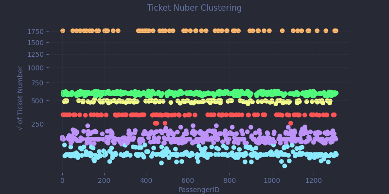
Is this an ideal approach? Probably not. There are likely better mathematical tools, but this quick-and-dirty method performs reasonably well. It's not perfect, but it earns its keep, even if a few tenths of a percent of accuracy might be left on the table.
As we dig into the fare data, an interesting pattern emerges: some ticket numbers appear multiple times, and the associated fares often seem unusually high.
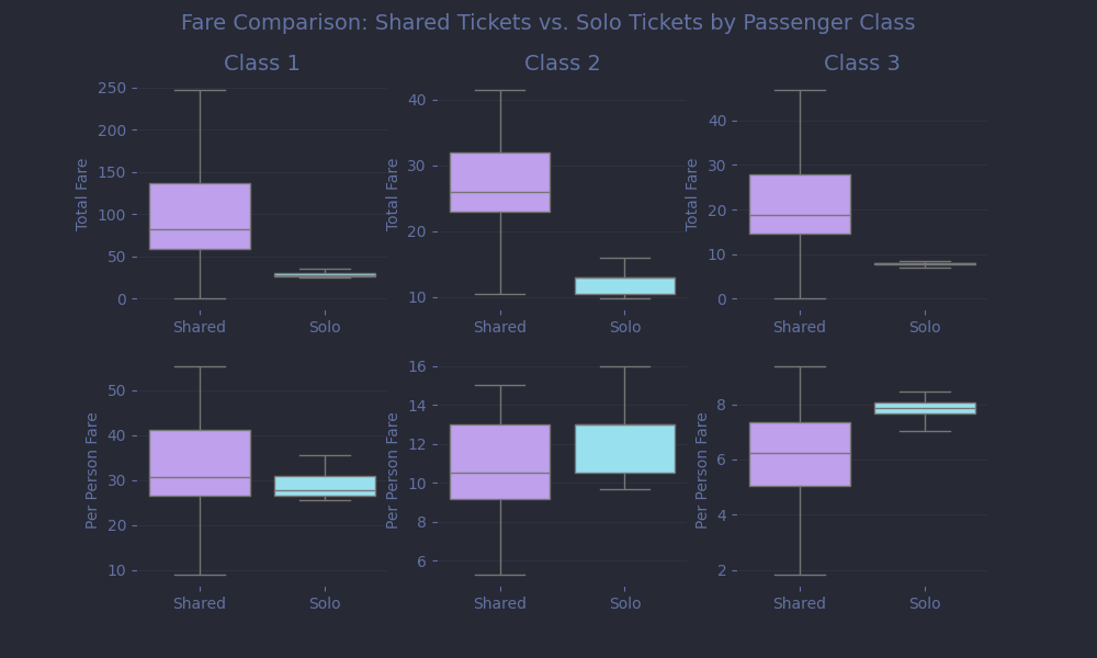
This suggests that these tickets were shared, likely covering the fare for an entire group rather than a single individual. We can thus improve our model by estimating the per-passenger cost. That means identifying the size of each group sharing a ticket and dividing the fare accordingly.
df['GroupSize'] = df.groupby('Ticket')['Ticket'].transform('count')
df['TicketType'] = np.where(df['GroupSize'] > 1, 'Shared', 'Solo')
df['PerPersonFare'] = df['Fare'] / df['GroupSize']
numeric_features += ['PerPersonFare']
But we can go further! If we assume that passengers who shared a ticket also traveled together, it’s reasonable to expect that their outcomes were at least somewhat correlated. Building on that idea, we can engineer a powerful new feature: the group survival rate.
overall_survival = df.loc[df['Survived'].notna(), 'Survived'].mean()
def calculate_group_survival(p_id, ticket):
    survival = []
    for p in df.itertuples():
        if p.Ticket == ticket:
            if pd.notna(p.Survived) and p.PassengerId != p_id:
                survival.append(p.Survived)
            else:
                survival.append(overall_survival)
    return np.average(survival)

df['GroupSurvivalRate'] = (
    df.apply(lambda row: calculate_group_survival(row['PassengerId'], row['Ticket']), axis=1).astype('Float64')
)
numeric_features += ['GroupSurvivalRate']
This implementation is very computationally inefficient, but it’s safe from data leakage, which is what really matters here. For each passenger, we scan the dataset for others with the same ticket number. If any of those companions are in the training set, we use their actual survival outcomes. If not, we fall back on the overall survival rate across all passengers. Crucially, we never include the current passenger's own survival when computing their group's outcome.
Age
Which brings us to our final missing piece: age. With 263 missing values, simply filling in the median feels like giving up. Age is just too valuable a signal to treat so casually. And since we’re about to do some machine learning anyway... why not start here?
age_features = ['Pclass', 'Sex', 'Fare', 'Embarked', 'Title', 'NbNames',
       'FamilySize', 'IsAlone', 'WithSpouse', 'WithChildren', 'WithParents',
       'DeckLevel', 'CabinLocation', 'TicketHasPrefix',
       'TicketCluster', 'GroupSize', 'PerPersonFare', 'GroupSurvivalRate'
]
age_df = df[age_features].copy()
for col in [f for f in age_features if f in categorical_features]:
    age_df[col] = age_df[col].astype('category')

age_train = age_df[df['Age'].notna()]
age_missing = age_df[df['Age'].isna()]
y_age = df.loc[df['Age'].notna(), 'Age']

params = {
    'objective': 'regression',
    'metric': 'mae',
    'num_leaves': 96,
    'learning_rate': 0.1,
    'min_child_samples': 3,
    'seed': SEED,
    'verbosity': -1
}

cv_results = lgb.cv(
    params | {'num_iterations' : 50000, 'early_stopping_rounds' : 50},
    lgb.Dataset(age_train, label=y_age),
    nfold=5,
    stratified=False,
    seed=SEED
)

age_model = lgb.train(
    params | {'num_iterations' : len(cv_results['valid l1-mean'])},
    lgb.Dataset(age_train, label=y_age)
)

predicted_ages = age_model.predict(age_missing)
df.loc[df['Age'].isna(), 'Age'] = predicted_ages
numeric_features += ['Age']
We start by gathering a set of features that might help predict age: ticket class, fare, group size, social status, and so on. Categorical columns are converted to the appropriate type. Then, we split the data into two parts: passengers with known ages (to train on), and those with missing values (to predict).
We’ll be using LightGBM, a fast and powerful gradient boosting trees algorithm implementation. It builds an ensemble of decision trees, where each tree learns from the mistakes of the previous ones. Given the simplicity of the goal, I didn’t obsess over hyperparameter tuning. We can set a relatively high learning rate (0.1) to speed up convergence and allow the trees to grow fairly deep (num_leaves=96) to capture nuanced patterns.
To avoid overfitting, we can rely on 5-fold cross-validation to find the optimal number of trees:
- Split the data into five equal parts.
- Train on four, validate on the fifth.
- Repeat five times, tracking the mean absolute error (MAE).
- Stop training early if performance stops improving for 50 rounds, and record the depth of the model (
early_stopping_rounds=50).
We then use the optimal number of boosting rounds to train a final model on the full age dataset.
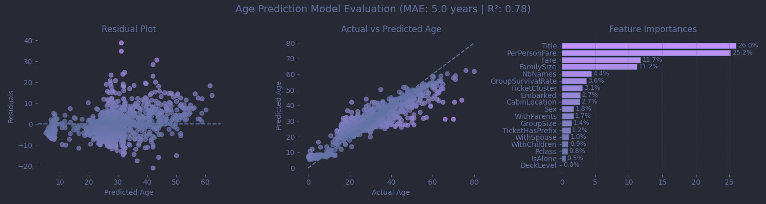
Was it worth it? Sort of. We got a MAE around 5 years, which sounds solid, but hides the model's weaknesses: for infants, a 5 years swing is huge, and elderly passengers were consistently aged down by the model. Still, this approach performs better than a static median, and it gives us enough confidence to keep Age as a continuous feature, thus letting the main model decide which age thresholds actually matter.
With age predictions now in place, we can finally define one of the most critical traits on board the Titanic: whether a passenger was a child.
df['IsChild'] = (
    (df['Title'] == 'Master') |
    ((df['Title'] == 'Miss') & (df['Age'] < 18))
)
categorical_features += ['IsChild']
Here’s the reasoning:
- The title Master reliably identifies young boys.
- Miss usually indicates an unmarried woman, but not necessarily a child. So we double-check with age for that group.
The Complete Feature Set
Before diving headfirst into hyperparameter tuning, let’s pause for a broader look at our feature set, and talk a bit about feature relationships and encoding strategy. A useful tool here is the correlation matrix, which helps us visualize how our features relate to one another.
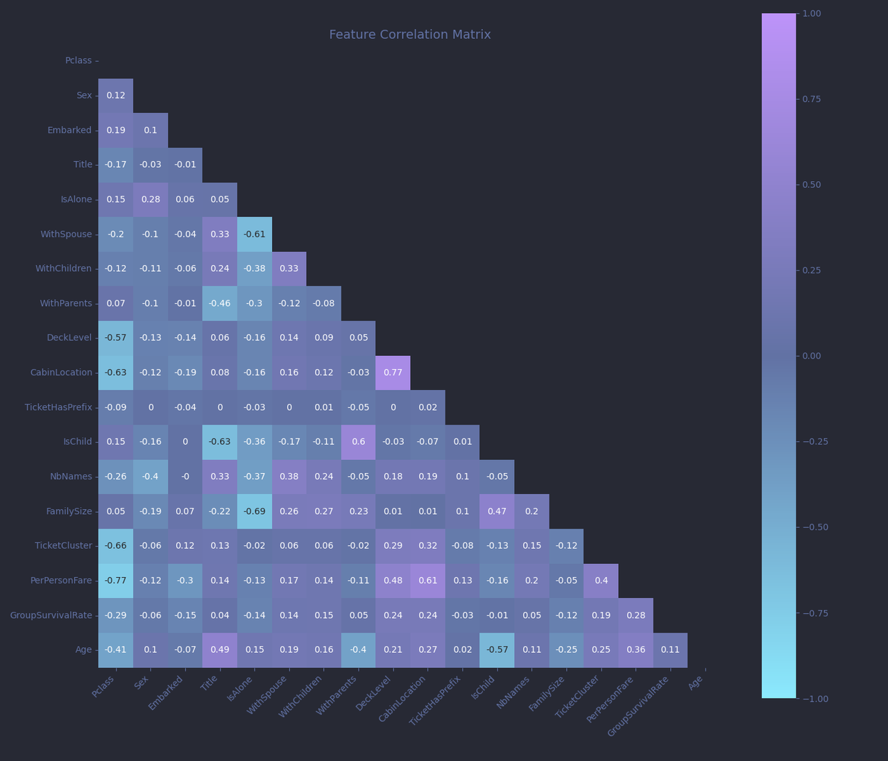
Each cell in the matrix shows the correlation coefficient between two features, ranging from -1 to +1:
- Close to +1 and the two features increase together.
- Near -1 means one increases as the other decreases.
- Around 0 suggests no relationship between the features.
Now, a few patterns stand out.
PerPersonFareandTicketClustershow a moderate positive correlation (r ≈ 0.4). That makes sense, as passengers with the same ticket numbers shared fares.TitleandIsChildalso show a strong correlation (r ≈ -0.63), is also expected, since the contruction ofIsChildis directly (but not solely) based onTitle.
While multicollinearity (strong relationships between features) can be a problem for linear models, it’s much less of a concern for tree-based algorithms like LightGBM. Trees make splits based on thresholds, not coefficients, and can decide which features to prioritize, even when some are correlated. Still, understanding these relationships will helps us interpret the model later on.
One of the other advantages of using LightGBM is that it handles categorical data natively. That means we don’t need to manually one-hot encode features like Title, DeckLevel, or Embarked. As long as a column is marked with the Pandas category dtype, LightGBM will take care of the rest, including handling missing values.
df_train = df[categorical_features + numeric_features + ['Survived', 'PassengerId']].copy()
df_train[categorical_features] = df_train[categorical_features].astype('category')
As for numeric features, I often see people scaling or normalizing them, perhaps out of habit from working with linear models or neural nets. But for tree-based models like LightGBM, scaling is unnecessary. Trees are scale-invariant, meaning they only care about the ordering and splitting thresholds, not the absolute magnitude.
2. The Actual Machine Learning
With features crafted and data prepped, it's time to work on the training itself. Let’s start by defining the fixed hyperparameters, meaning the settings we won’t optimize during our search:
fixed_params = {
    'metric' : ['binary_logloss'],
    'objective' : 'binary',
    'boosting' : 'gbrt',
    'learning_rate' : 0.01,
    'is_unbalanced' : True,
    'verbose' : -1,
    'seed' : SEED
}
We set the objective to binary because we are working on a binary classification problem - passengers survived (1) or not (0). We use binary_logloss as the metric, which measures how close the predicted probability is to the true label. A perfect prediction gets zero loss; confident but wrong predictions are penalized harshly. We then set is_unbalanced=True accounts for the class imbalance in the dataset: more people died than survived. This setting automatically adjusts weights of the training data so the model doesn't just learn to predict “everyone died” to get a high score. And finally, I chose to fix a pretty low learning rate, forcing a slower but more careful learning and helping the model discover more subtle patterns.
Hyperparamter Tuning
Now comes the tricky part: tuning. It’s a blend of science, intuition, and sometimes pure luck. Some practitioners can glance at a dataset and confidently select near-optimal settings. That is unfortunately not me. I need to experiment and iterate my way to something that works.
def train_evaluate(search_param_list):
    search_params = {k: v for k, v in zip(search_param_names, search_param_list)}
    cv_results = lgb.cv(
        params = fixed_params | search_params | {'num_iterations' : 50000, 'early_stopping_rounds' : 50},
        train_set = lgb.Dataset(X_train, label=y_train),
        nfold = 10,
        stratified = True,
        shuffle = True,
        return_cvbooster = True,
        seed = SEED
    )
    nb_iters[tuple(search_param_list)] = len(cv_results['valid binary_logloss-mean'])
    return cv_results['valid binary_logloss-mean'][-1]

search_param_names = ['num_leaves', 'min_data_in_leaf', 'colsample_bynode']

nb_iters = {}

result = gp_minimize(
    train_evaluate,
    [
        Integer(16, 64),        # num_leaves
        Integer(10, 50),        # min_data_in_leaf
        Real(0.01, 0.8),         # colsample_bynode
    ],
    callback=[LoggerCallback()],
    n_initial_points=20,
    n_calls=200,
    n_jobs=-1,
    random_state=SEED
)

best_params = {k: v for k, v in zip(search_param_names, result.x)}
best_params['num_iterations'] = nb_iters[tuple(result.x)]

print(f'Total evaluations: {len(result.func_vals)}')
print(f'Lowest Logloss: {result.fun}')
print('Best parameters:')
for k, v in best_params.items():
    print(f'{k} : {v}')
So what’s going on here? We’re using Bayesian optimization (specifically gp_minimize from scikit-optimize) to intelligently explore the hyperparameter space. Unlike random search or grid search, which test combinations blindly, Bayesian optimization focuses its efforts where the most promising results are likely to be found. Based on my intuitions, I chose 3 important parameters to tune:
-
num_leavescontrols the maximum complexity of each tree. Higher values allow deeper splits and more detailed patterns, but will increase the risk of overfitting. -
min_data_in_leafprevents the model from creating overly specific rules by requiring a minimum number of samples in each leaf node. It will help with overfitting. -
colsample_bynoderandomly selects a fraction of features to consider at each split, reducing the risk that a few dominant features drown out others. Very important with our highly correlated features !
Just like in our age model, we cross validate our model for each set of hyperparameters, using early_stopping_rounds to give us the optimal num_iteration for this set.
Why not tune more parameters? I tried some others, like row subsampling, regularization terms (lambda_l1, lambda_l2), and tree-level feature sampling, but they didn’t yield meaningful improvements. Sometimes, simpler is better.
And after 200 evaluations, here’s what we landed on:
Total evaluations: 200
Lowest Logloss: 0.3682426647475686
Best parameters:
num_leaves : 59
min_data_in_leaf : 34
colsample_bynode : 0.3171901661158282
num_iterations : 411
I’ll admit, the results surprised me. I expected smaller trees and heavy regularization. But the search converged on a fairly complex structure with even heavier regularization than I thought would be necessary. Still, I trust the process, and the cross-validation log loss is promising. At this point, we could simply train the final model and submit predictions, but I’ve got one last trick up my sleeve.
Threshold Optimisation
You see, while our model outputs probabilities between 0 and 1, we don’t have to use the default threshold of 0.5 to decide who lived and who didn’t. The Titanic competition is scored on accuracy, not precision or recall. That means all we care about is whether the final prediction (0 or 1) matches the actual outcome, not how confident we were about it, or which kinds of errors we made.
So what happens if we adjust the threshold?
By nudging it higher, we can become more conservative in predicting survival. That means we’ll label more borderline cases (say, with a 60% predicted chance of survival) as deaths.
nfolds = 5
folds = StratifiedKFold(n_splits=nfolds, shuffle=True, random_state=SEED)
oof_pred = np.zeros(len(X_train))

for train_idx, val_idx in tqdm(folds.split(X_train, y_train), total=nfolds):
    X_tr, X_val = X_train.iloc[train_idx], X_train.iloc[val_idx]
    y_tr, y_val = y_train.iloc[train_idx], y_train.iloc[val_idx]
    model = lgb.train(
        fixed_params | best_params,
        lgb.Dataset(X_tr, label=y_tr)
    )
    oof_pred[val_idx] = model.predict(X_val)

print('Standard threshold: 0.5')
print(classification_report(y_train, (oof_pred >= 0.5).astype(int)))

best_thresh = 0.5
precisions, recalls, thresholds = precision_recall_curve(y_train, oof_pred)
valid_indices = np.where(recalls[:-1] >= 0.6)[0]
if len(valid_indices) > 0:
    best_idx = valid_indices[np.argmax(precisions[valid_indices])]
    best_thresh = thresholds[best_idx]
    print(f"Optimal threshold: {best_thresh:.4f}")
else:
    print("No threshold meets recall constraint. Using 0.5")
print(classification_report(y_train, (oof_pred >= best_thresh).astype(int)))
Standard threshold: 0.5
              precision    recall  f1-score   support

         0.0       0.84      0.91      0.88       549
         1.0       0.84      0.72      0.77       342

    accuracy                           0.84       891
   macro avg       0.84      0.82      0.83       891
weighted avg       0.84      0.84      0.84       891

Optimal threshold: 0.7301
              precision    recall  f1-score   support

         0.0       0.80      0.98      0.88       549
         1.0       0.94      0.61      0.74       342

    accuracy                           0.84       891
   macro avg       0.87      0.79      0.81       891
weighted avg       0.85      0.84      0.83       891
At first glance, the numbers are confusing. The adjusted threshold results in more false negatives: we’re misclassifying some survivors. And yet... accuracy doesn’t drop. In fact, when tested on the final leaderboard, this higher threshold consistently scores about 2% better. Why?
Because of class imbalance. Deaths vastly outnumber survivors. So when we raise the bar for predicting survival, we’re effectively saying: “If the model isn't really sure someone lived, assume they didn’t.” Statistically speaking, that's the safer bet and favoring worse odds increases raw accuracy, even if it significantly worsens recall.
But be warned: this is a mostly competition-specific trick. In real-world applications, where false positives and false negatives have real consequences, this would be a terrible idea. You wouldn’t want a cancer screening tool or fraud detector to blindly favor the majority class just to increase a flawed metric.
Final Training and Submission
With our threshold fine-tuned, it’s time for the final move: training our model on the entire training dataset. No more cross-validation splits, every last data point will now contribute to the final prediction.
model = lgb.train(
    fixed_params | best_params,
    lgb.Dataset(X_train, label=y_train)
)

y_pred = model.predict(X_test)

df_pred = pd.DataFrame({
    'PassengerId': test_ids.reset_index(drop=True),
    'Survived': (y_pred >= best_thresh).astype(int)
})

df_pred.to_csv(f'predictions_v6-{SEED}.csv', index=False)
And now, the moment of truth.
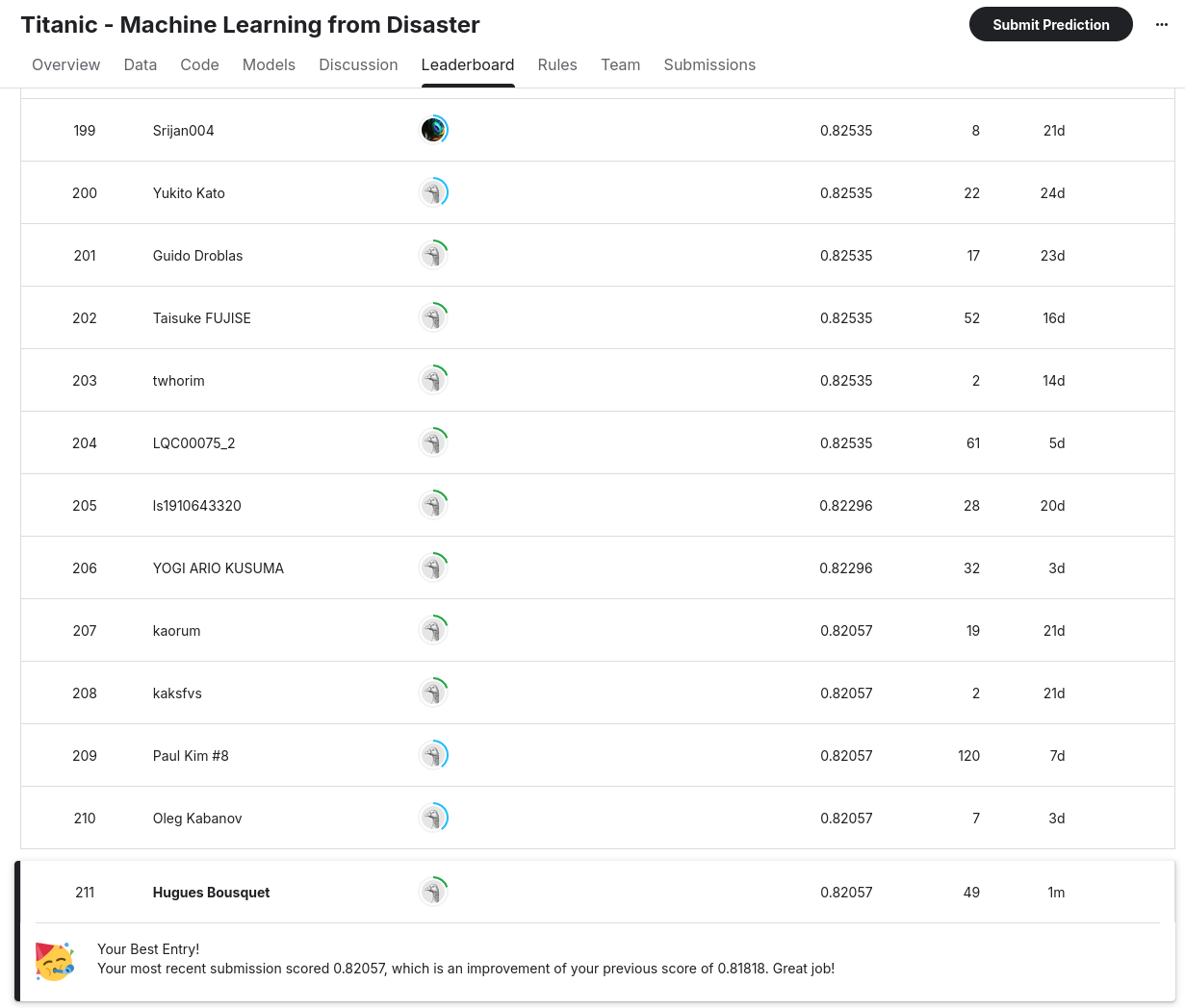
Submitting to the leaderboard gives us a score of 0.82057, which, at the time of writing, lands us in 211th place out of 15,222 teams, within the top 1.5% of all competitors. To test robustness, I reran the script with different random seeds (2 and 3). The scores came back as 0.81100 and 0.82057 respectively. That might look like a big swing, but it in fact only amounts to only two passengers classified differently which is well within the expected noise.
Could we push it even further? Probably. There’s always room to improve, for example by incorporating more external data to refine the feature engineering step, being more aggressive with feature selection or trying to train an ensemble. But at this point, each new gain will require exponentially more effort. We’re deep into diminishing returns territory here. And more importantly, even with all the data science in the world, some outcomes remain stubbornly unpredictable, as we are about to see.
3. Peeking Inside the Black Box
Now comes the fascinating part: understanding why our model makes the predictions it does. But we must tread carefully. It’s a common and tempting mistake to confuse correlation with causation when interpreting machine learning models. Even the competition prompt (“What sorts of people were more likely to survive?”) subtly nudges toward a causal interpretation that the model simply cannot support.
So let’s be clear about what we’re doing here. We’re not analysing the reasons people survived. We’re examining the patterns our model learned, meaning the statistical correlations that it observed to predict survival and death. For example, traveling first class is a strong predictor of survival. But that doesn’t necessarily mean first-class cabins caused someone to live. Drawing that kind of conclusion requires a completely different approach: controlled experiments, confounder analysis, and careful assumptions about how variables influence each other. If you’re interested in the dangers of interpreting predictive models as if they were causal explanations, the SHAP documentation has an excellent write up on this topic.
With that in mind, let’s dive into what the model learned.
Feature Importances
First, let's take a look at feature importances. Fortunately, LightGBM makes this easy. It tracks how often each feature is used to split the data across all trees in the model. Plotting these importances gives us insight into what the model “paid attention to” when making predictions.
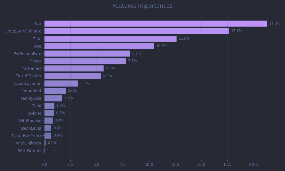
As expected, gender, age, and social class dominate, which is in line with the well-known “women and children first” protocol, as well as the privileged access to lifeboats for wealthier passengers.
-
Sextops the list with 21.3% of total importance. Unsurprising, as survival rates differed sharply between men and women. -
Agecontributes 10.5%, beating out our manually-engineeredIsChildfeature (1.0%). This suggests the model learned nuanced age splits on its own, for example perhaps finding that age < 10 mattered more than age < 18. -
PerPersonFare(8.2%) andPclass(7.8%) act as proxies for wealth and social status, important predictors.
A standout is Title, accounting for 12.6% of importance. At first glance, that may seem surprising. But when you consider that it encapsulates gender, marital status, age, social status, and even hints at profession and physical fitness, it becomes clear why the model leaned on it heavily.
And finally, all that effort crafting GroupSurvivalRate paid off: it came in as the second most important feature overall. This validates our hypothesis that passengers traveling together shared correlated fates.
SHAP Beeswarm Plot
While feature importance tells us what the model uses to make predictions, SHAP (SHapley Additive exPlanations) values reveal how each feature influences individual predictions.
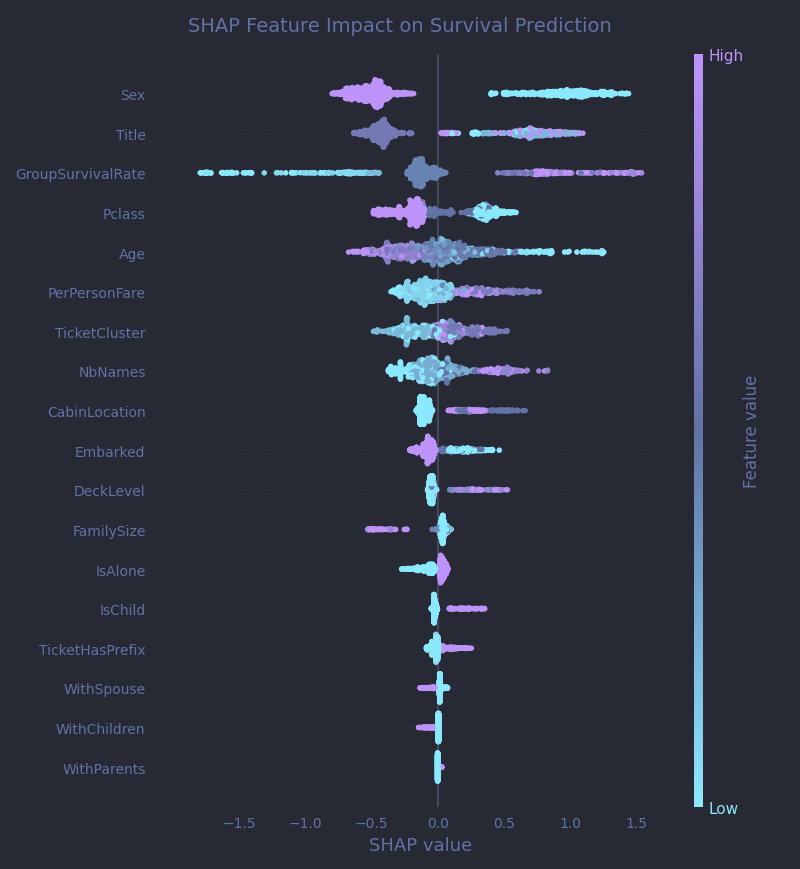
A SHAP beeswarm plot is one of the best tools for this kind of interpretation. Each dot on the plot represents a single passenger. The position on the X-axis shows how much a particular feature pushed that passenger's prediction away from the baseline (the average model output across all passengers): dots to the right (positive SHAP values) push the prediction toward survival, while dots to the left (negative SHAP values) push it toward death. The color adds another layer: it encodes the feature value.
Let’s break it down with an example. Sex, the top feature, is crystal clear:
- Purple dots (male passengers) cluster far to the left, indicating a strong push toward predicted death.
- Cyan dots (female passengers) sit sharply to the right, associated with predicted survival.
GroupSurvivalRate stands out with a wide horizontal spread. High group survival values (purple dots) strongly nudge predictions to the right, suggesting that passengers from surviving groups were expected to survive themselves. Low values (cyan) sharply push predictions to the left, as entire groups often perished together.
DeckLevel, interestingly, appears to be quite a strong predictor with a sharp split on the SHAP plot, even though its raw feature importance was just 0.6%. The explanation? It’s highly predictive when it exists! Lower decks strongly correlate with death, but most entries lack cabin data. This hints that improving cabin coverage (e.g., with external sources) could still unlock measurable gains.
Personal Stories
But the Titanic was, first and foremost, a human tragedy. Behind every row in our dataset lies a real person, someone who faced an unthinkable night of terror. To honor that, and to humanize the cold predictions, we’ll step away from aggregate statistics and turn to individual stories. Using SHAP waterfall plots, we can visualize how specific circumstances influenced a passenger’s predicted fate. And thanks to the incredible work of Encyclopedia Titanica, we can connect the dots between data and history, giving names and faces to the passengers our model tries to understand.
 |
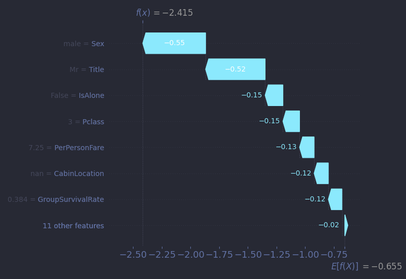 |
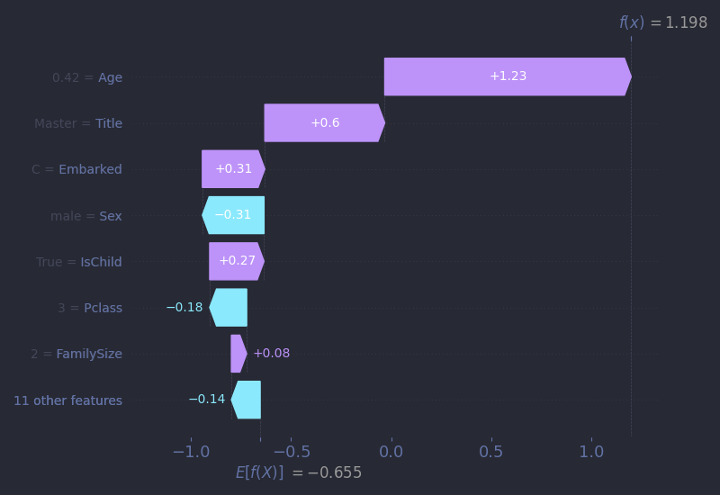
Let’s begin with Mr. Owen Harris Braund. Mr. Braund was a 22-year-old farmer from Devon who boarded Titanic as a third-class passenger. He was traveling with four cousins and a brother, six men in total, all bound for Saskatoon, Saskatchewan in search of a new life. He paid £7 5s for his ticket which was a significant investment for a laborer. None of the six survived. A family friend, Susan Webber, traveling second class, did.
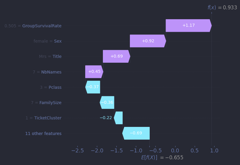
Let’s examine his SHAP waterfall plot. These are read from the bottom up. The base value at the bottom, E[f(X)] = -0.655, is the model's expected log-odds of survival across the whole dataset. Log-odds are simply a transformed version of probabilities. You can convert them using the formula:
$$P_{survived} = \frac{1}{1+e^{-(log-odds)}}$$
In this case, the base log-odds of -0.655 correspond to about 31.4% chance of survival. From there, each arrow represents the impact of one feature: purple arrows (pointing right) push the prediction toward survival, while cyan arrows (pointing left) push it toward death.
For Owen, the arrows tell a familiar story. He really represented the average Titanic passenger: a young, third-class male. Every major feature pushes his prediction downward: male gender, low fare, group size, class, and age. The model gives him a meagre 8% chance of survival, and tragically, it is right.
 |
 |
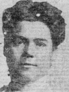
Next, let’s look at a miraculous case: the five-month-old As’ad Tannūs. As’ad boarded the Titanic at Cherbourg, France, with his mother Thamīn and uncle Charles. They were third-class passengers from Lebanon, traveling with hope to reunite with As’ad’s father in Pennsylvania. When the ship began to sink, Thamīn got separated from her family and managed to reach a lifeboat while Charles still held As’ad tightly in his arms. Somehow, the infant ended up into another lifeboat and was rescued. Though he was hospitalized for hypothermia and exposure, As’ad survived. Sadly, he died of pneumonia at just 20 years old.
As for the model, almost every one of As’ad’s features points to grim odds: he was a third-class, male, Middle Eastern immigrant - all factors that, on average, could have led to a low survival chance prediction. But one thing stands out: his age. Even though there are very few infants in the dataset, the model appears to have learned that very low age is highly correlated with high odds of survival. Thanks to this pattern, the model correctly predicts As’ad’s survival with surprising high 76% confidence. This is a great example of how even sparse signals, if distinct enough, can override larger statistical trends in individual cases.
 |
 |
Miss Ann Eliza Isham, on the other hand, represented American aristocracy. She was 50 years old and the daughter of a prominent American judge and the law partner of Abraham Lincoln. She boarded Titanic at Cherbourg, bound for New York to spend the summer with her brother. A first-class passenger in cabin C-49, she had in theory every advantage: gender, wealth, status, access... And yet, she was one of just four first-class women who did not survive. According to legend, Miss Isham was accompanied by her Great Dane and the story goes that she refused to board a lifeboat without her dog. While no evidence confirms this, the tale endures. Her body, if recovered, was never identified.
Our model, of course, doesn't know any of this. It sees her profile (older women, wealthy, first-class...) and predicts survival with 88% confidence. Statistically, it is the right call. But Miss Isham’s story tragically reminds us of a fundamental limitation of even the best predictive models: no feature could ever completely describe the complex reality of the situation (did a crew member gave her a wrong direction?) or psychological state (was she really attached enough to her dog to sacrifice herself?). And as an aside, it’s also a reminder to be wary of models that claim perfect or near-perfect accuracy (looking at you, Kaggle Leaderboard!). The world resists tidy predictions, especially when involving human behavior.
 |
 |
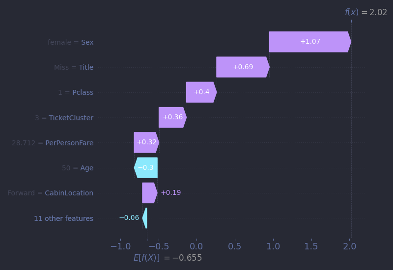
Next, we turn to a wealthy banker from Philadelphia, Mr. Cardeza, who booked what was the most expensive suite on the ship for a staggering £512 (equivalent to around $70,000 USD today !). He was accompanied by his mother, Mrs. Charlotte Cardeza, and their manservant, Gustave Lesueur. Their first-class ticket even included a private promenade deck! When disaster struck, all three members of this entourage were safely placed into Lifeboat 3, and all survived. Mr. Cardeza later served as a diplomat during World War I.
But while his wealth and class status might lead us to assume a straightforward prediction, his SHAP waterfall plot reveals something more nuanced. Despite the insane fare, the fare feature alone contributes very little to his predicted survival. In fact, it accounts for less than a quarter of force needed to offset the push from his gender. Being male carries a heavy penalty for our model, even for first-class men. Instead, the key factor tipping the balance is GroupSurvivalRate. The model recognizes that passengers traveling with others who survived had a high chance of surviving themselves. In Mr. Cardeza’s case, it is this feature and not money or social rank that pushes his prediction above the threshold. This is a perfect example of the warning given above about confusing correlation and causation. Did Mr. Cardeza survive because his group did? Or did they all survive because of their privilege, their early access to the boat deck, or the crew’s willingness to prioritize them? The model can’t tell us any of that.
 |
 |
And finally, we come to one of the most touching stories among Titanic’s passengers: Mrs. Selma Asplund. A 38-year-old mother from Sweden, Mrs. Asplund boarded the Titanic as a third-class passenger with her husband Carl and their five children. The family was emigrating to Worcester, Massachusetts, chasing the dream of a better life. Unfortunately, while Selma, 5-year-old Lillian, and 3-year-old Felix survived, her husband and their three sons did not. The family was shattered. After the disaster, a community fund was organized to support her and her children. Remarkably, she died on April 15, 1964 - the 52nd anniversary of the sinking.
When we examine her SHAP waterfall plot, one detail stands out: her GroupSurvivalRate sits at around 50%, and yet it plays a large role in increasing her predicted survival. But on second thought, in a dataset where only about 38% of passengers survived, a 50% group survival rate is actually above average. It contrasts sharply with Mr. Braund’s case, where his group’s 38% rate slightly dragged his prediction downward. In Mrs. Asplund’s case, this feature, combined with her gender, allows the model to assign her a 71% probability of survival, a prediction that ultimately aligns with history. But stopping at that number misses something essential. The model predicts a survivor. The story, though, is that of a mother who lost her husband and three sons and of a family torn apart. That kind of loss doesn’t show up in any feature or plot. It’s a reminder that sometimes, data only gives us a sliver of the story. To understand the rest, we have to look at the lives behind it.
Conclusion
As we reach the end of our journey from raw passenger data to an 80%+ accurate prediction model, it's worth pausing to reflect on a few key takeaways I hope you, dear reader, will carry with you:
- Feature engineering is often more important than fancy algorithms. Exploring text features like
Title, group dynamics likeGroupSurvivalRate, and spatial context such asDeckLeveldelivered more gains than any advanced hyperparameter tweak. - Context beats correlation when it comes to causation. Predictive models help us uncover how features interact to produce outcomes, but only human stories can explain why those outcomes occurred.
- With effort and tenacity, placing high in competitions is absolutely possible. It's all about your willingness to learn!
And now, it's your turn at the helm. Learning happens by doing, so go ahead and try to beat my score, or better yet, find a competition that speaks to your curiosity. You can flip through my full notebook on GitHub, along with a streamlined and annotated Python script omitting the visualization code. Machine learning, like the ocean, rewards curiosity and persistence. Fair winds, fellow data traveler!
Special thanks to Encyclopedia Titanica for preserving passenger stories. This article is dedicated to the 2,208 souls aboard RMS Titanic.